


The Highlighter
Managing information overload in text-heavy exhibits
Clients: Bainbridge Island Historical Museum & Fosterfields Living Historical Farm | Co-created with: Deborah Golerik & Themis García
#assistivetech #accessibility #design #museumaccessibility #userexperience
Issue: Through research and discussions with museum professionals, we noticed that navigating content in museums was an accessibility challenge for visitors.
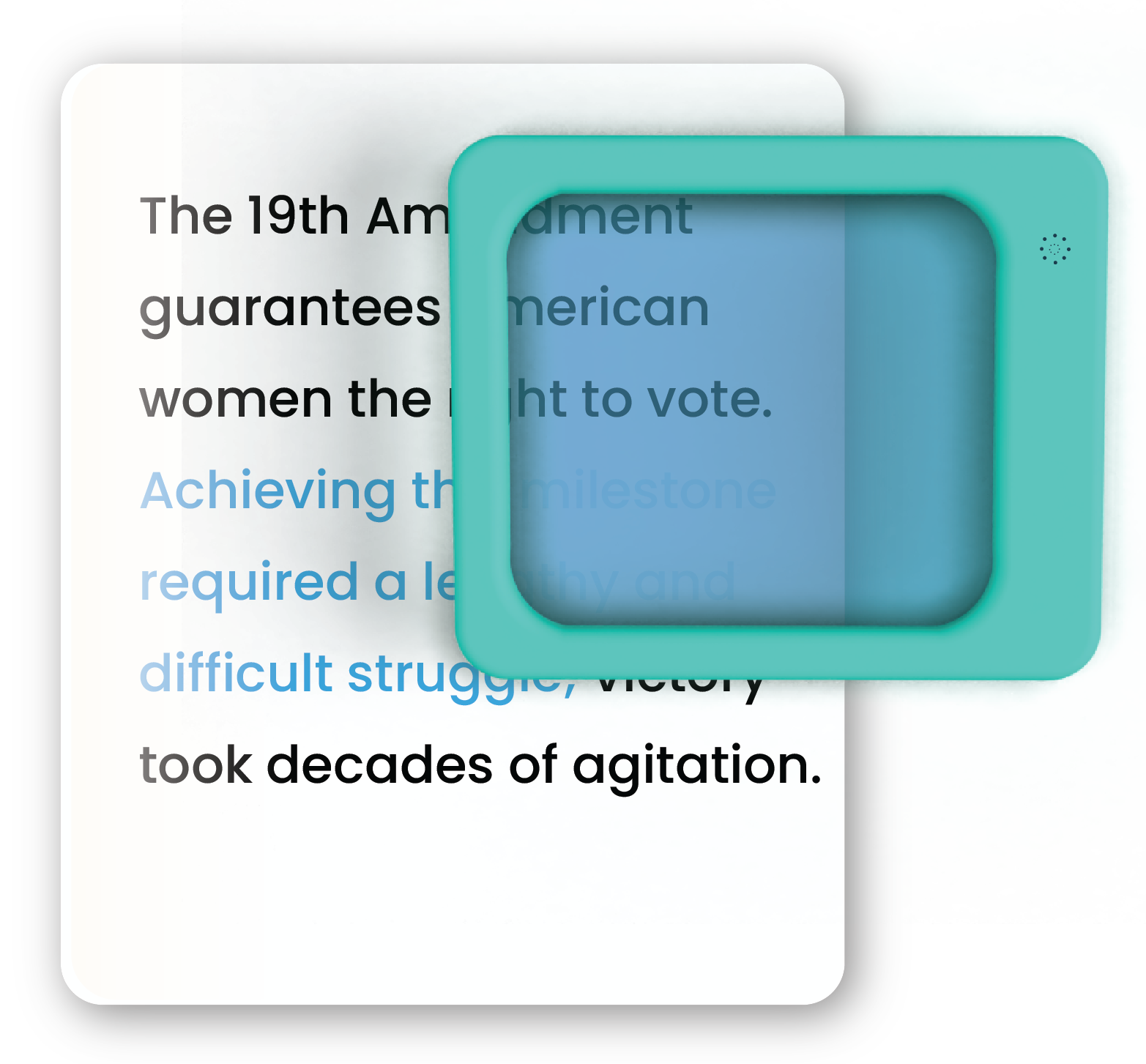
The Highlighter implements a low-tech color filtering technique to address over-stimulation text-based content.
Problem Space
How to help overstimulated visitors to navigate museum content.
Key Research Questions
🔎 How do museums manage over-stimulating environments?
🔎 What solutions have museums considered for improving user engagement in the content?
🔎 What technology already exists that helps in managing the amount of information?
Interviews, Workshops and Secondary Research
To gain a better understanding of the needs and requirements, my team conducted several interviews between museum personnel and our working group. Our insights helped us find the pain points for users and constraints for museum staff.
We found that people of all ages experience overstimulation in museum settings as well as people with cognitive learning challenges or those considered as neuro-diverse. Also, people experiencing fatigue, anxiety and visual stress can be met with this issue.

Design Process | Ideation
We explored multiple designs to manage information overload with text. Our solution was to create guidelines to make accessible labeling from scratch and to develop a device that highlights relevant information.
Design
Color Filtering
By using color filtering, we remove as much textual information as possible, while retaining key information. Visitors with difficulties processing information can then focus, engage with the content and retain knowledge.
How does it work?
Text which is printed in the same color as the filter will be neutralized and, for all effects, “invisible”.

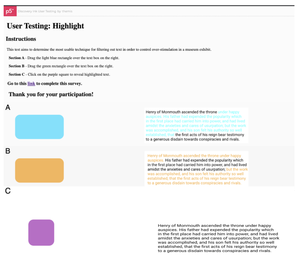
User Testing
We developed a custom web-based prototype and ran remote user tests to evaluate text, color and interaction models.

Implementations
This design has multiple possibilities for implementation, depending on the museum’s requirements and budgetary constraints
Wall-mounted
Visitors pick up the viewer and navigate the information on a wall graphic.


Fixed
A horizontal stand fixed to the wall.
Free-standing
A free-standing display, where the content is positioned on top. The viewer rests on one side of the display


Handheld
This implementation is a low-cost approach where the museum provides a simple foldable object with content that is easily swapped with other documents. The content, a paper document, slides into the folder to achieve the highlighting effect.